LOOOOK.me
UI & UXLOOOOK.me
OVERVIEW
n
Web Navigation as an unique product for the Chinese market, and has achieved great success. However, all of them only focus on popular Chinese websites. None of them have a worldwide collection. Since more and more Chinese people are studying or living overseas, most of them do not know what are the popular websites in foreign countries. Based on this, I created a web navigation for overseas Chinese people, especially for students. This is to help them find their favorite sites in the shortest time. LOOOOK.me is a web navigation for overseas Chinese.
PROCESS
n
Before I started creating LOOOOK.me, I compared several well known Chinese web navigations. These websites all use text link. After interviewing numerous students I came to a conclusion that they did not like the current web navigations, because the interface seems outdated. So I decided on the use of graphics instead of text to create a contemporary element.
Some websites are blocked by China, many Chinese people can not access these websites. Therefore, I created another edition for people in China. Both the worldwide edition and Chinese edition can be automatically changed based on the USER’s IP address.
THE FIRST DRAFT OF LOOOOK.ME
n
After the user research, I created the first edition. In this edition I tried to capture the website screen as a website icon. But after this prototype, I found some problems. There are four categories, one is home page for popular websites, one is brand pages, one is the rank of websites, the last one is random. In case not confuse the user, just keep the popular websites and brand page into the final deliverable. Integrated the rank of website as second level of the page. Gave up the random function.
THE CURRENT WEB NAVIGATION PROBLEMS
1.Most popular websites do not look visually appealing in small scale. However, scale does not affect those of branded goods.
2.The size of the grid will influence usability. There are limited websites displayed on the first page.
SOLUTIONS APPLIED FOR LOOOOK.me
To change the icons from each website’s entire capture screen to their logo. Each logo is clearer to users, and more websites can fit onto the first page, thus improving usability.Based on findings, I made the next edition of navigation. After many user tests, and revision of problems. I uploaded this edition online.
Link to LOOOOK.me
HOME PAGE FUNCTION INNOVATION & DETAIL
HOME PAGE
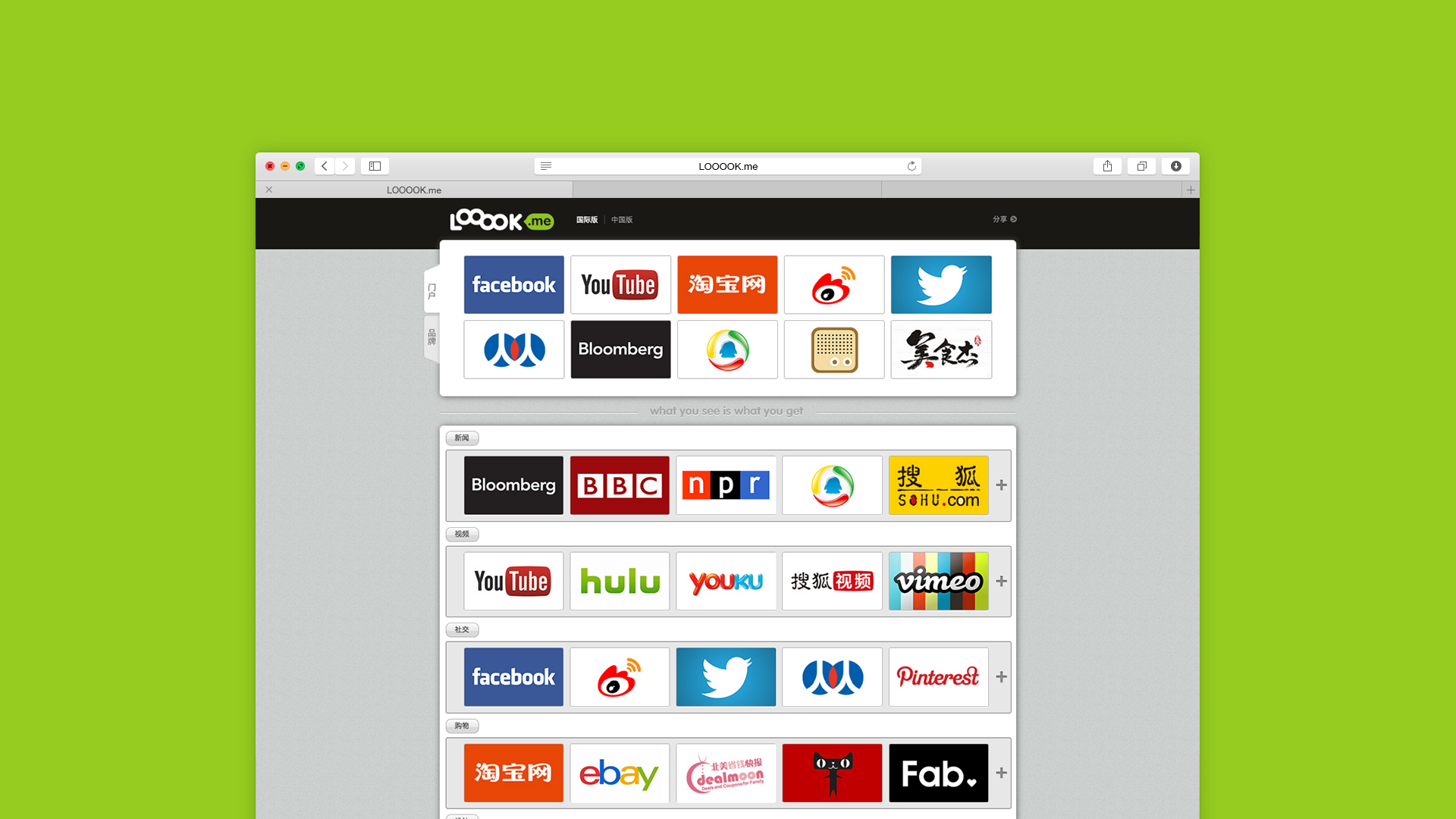
All the popular websites are collected in home page.
The top ten popular websites are fixed on the top of the page. The rest of the page are organized by categories.
About the layout, the young people more prefer info graphic than text only website. Also, graphic is more acceptable than text from visual aspect. So how to use graphic instead of text for a navigation website is a question at the beginning of this project. After the low-fidelity prototype, the screenshot took too much space in page. Also, many popular websites layout are very simple and have many blank areas. If use screenshot, these two cons will impact the user experience. After that, I found logo might be a good choice to solve this problem. For the current LOOOOK.me website, there are 5 logos in one line, took less space than the screenshot which only contain 3 websites as the same width. The logos also take less space height. It can contain twice number of websites as the same height as before. After the user testing, most of user can recognize the website from the logo without text. So this became to the final deliverable to LOOOOK.me.
1. FAVORITE ICON
The domain is LOOOOK.me, there is four “O”s inside of look, how to let people remember it and interesting is a question. The favorite icon become more and more important, it is small but require designer that can be easy and outstanding recognizable for users. Finally, the idea came up with the most popular game call “Mahjong” in China. One of the cards has four “O” on the card. So I drew the this card with photoshop and make it really recognizable after several user tests.
2. ARROW BUTTON
When user expend all the website, the arrow button will show at the bottom of this category. Just one click, all the expend websites will back to default(5 websites show in one line).
3. PLUS & MINUS BUTTON
User can click the plus button to expend the websites with the animation transition, thus to see more websites in one page instead of jump to a new page. The minus button will show after user click the plus button. So user can hide the website as the same action. This is very important user experience for a navigation website. On the other hand, user still can click the category name to see all the same category websites in one page.
4. SWITCH TAB
The switch tab on top left of the page, when user mouse over the tab, the section next to the switch tab will show different content. This section shows popular websites as default. The second tab is show brand websites. User also can click the brand tab to the brand page.
5. FAVORITE ICON
When user mouse over the website logo, the logo will become 60% transparent dark grey and the favorite icon will show on top of the logo. User can click the favorite icon to show his favorite, thus improve the rank of the website.
6. INTERNATIONAL VERSION VS CHINESE VERSION
As LOOOOK.me aim to focus overseas Chinese people, especially Chinese students. LOOOOK.me have two versions, the international version and Chinese version.
The reason is some websites can not be browsed in China. For example, FACEBOOK, TWITTER etc. So in case let user still want to use LOOOOK.me when they back to China. The Chinese version only has the websites that can be browsed in China. More than that, to avoid user switch the two version manually, the international version and Chinese version will switch based on user’s IP address, thus improve the user experience.
BRAND PAGE FUNCTION INNOVATION & DETAIL
BRAND PAGE
All the popular brands are collected in brand page. On the other hand, brand page is second level of the whole website. The brand page layout is different compare to the home page. The brand page adopt the screenshot instead of the brand loge. The reason is brand website is usually updated in a short time compare to the popular website from the layout aspect. So the screenshot will always refresh and attract users’ attention compare to the brand logo. Moreover, the loge will give users a feeling of advertising. This will impact the user experience when they browse the brand page.
1. VIEW DIFFERENT VERSIONS OFFICIAL WEBSITES AT SAME TIME
From the user research feedback, young people especially girls like to browse brand luxury websites. There is one special situation for Chinese girls. They like to browse the American official website and Chinese website at the same time that they can compare the product styles and price. Based on this point, I created two buttons right bottom of the each brand. There is “EN” stand for “English official website” and “中” stand for “Chinese official website”. User can click each of the link to the official website she wants. Moreover, when user mouse over between the “EN” and “中” buttons, the screenshot of the brand also automatically switch based on button user hover. So user can see the different version websites of same brand before click.
2. BRAND LANGUAGE SWITCH
When user mouse over the different version buttons, the brand name also switches based on the version button. This will help user to remember the brand name. The reason for this function is some Chinese people familiar with a brand, but they only recognize when they see the English name or Chinese name. This result is from the interview.
After this being online for a few months, I received many helpful and thoughtful suggestions and feedbacks from users. Based on these points, I will update and add new functions on the next version. For visiting the current LOOOOK.me navigation website. Please Click Here : )
Thanks for reading!