iScale
Film, Illustration Design, Motion, UI & UXiScale
INTRODUCTION
The requirements of this project is to find user’s needs and solve the problems. We combined current technology with traditional devices. The final deliverable is an smart interactive iScale which fuses portable devices and the traditional scale. The goal is to give users a scientific way to lose weight and to improve their health.
This project was a collaboration with other two team members, one is responsible for user interface one is for scenario.
Finished in Visual Interface and Information Design class at SCAD.
SKETCHES PERSONAL INTERFACE PROCESS
These sketches were created at the beginning of the project. They were used for brainstorming ideas for possible functions for the application we were creating. We were aiming to enhance scientific data, making it look more captivating and fun. For example, the body shape options will offer “Super Model” and “Standard” instead of using the standard pounds.
SKETCHES PERSONAL INTERFACE PROCESS
This application can give users diet and exercise suggestions. From this sketching step, we also thought about the info graphic we might have for the iPad.
*How to compare realistic body shape with standard body shape is a question we faced in this process.
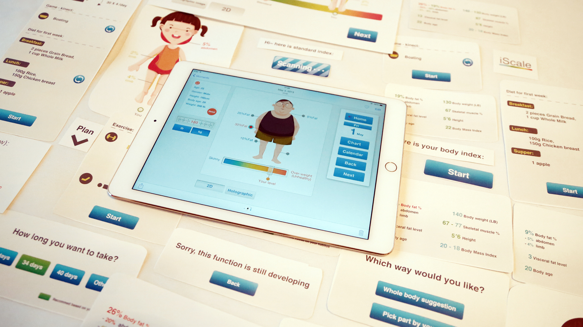
THE PAPER PROTOTYPE & USER TESTING
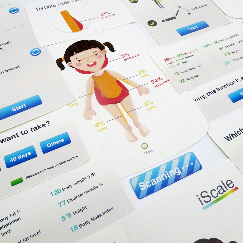
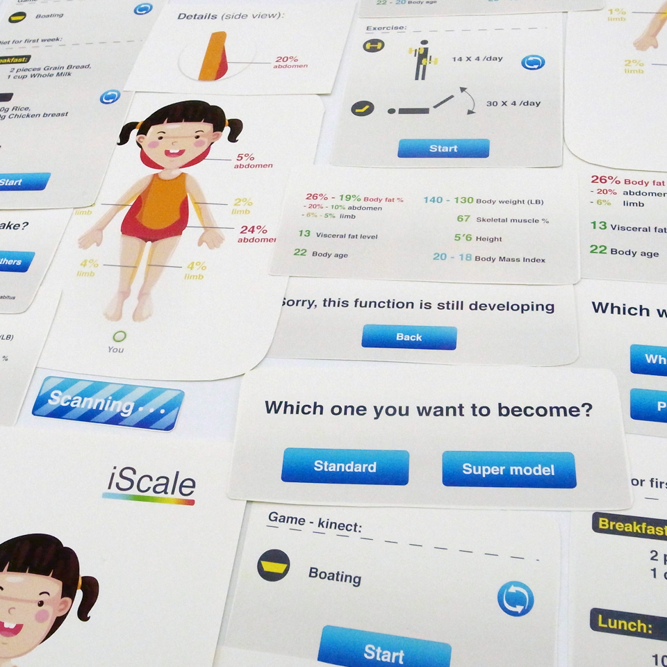
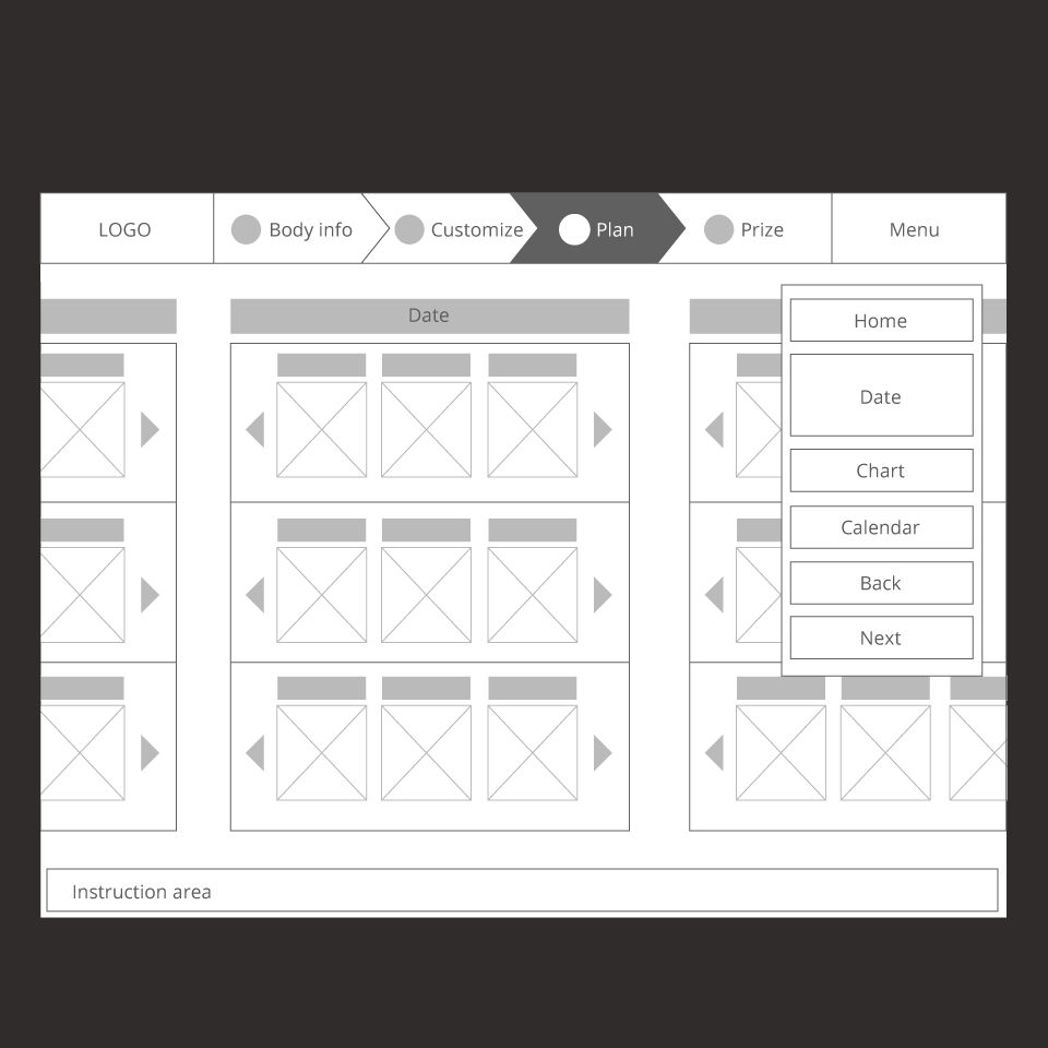
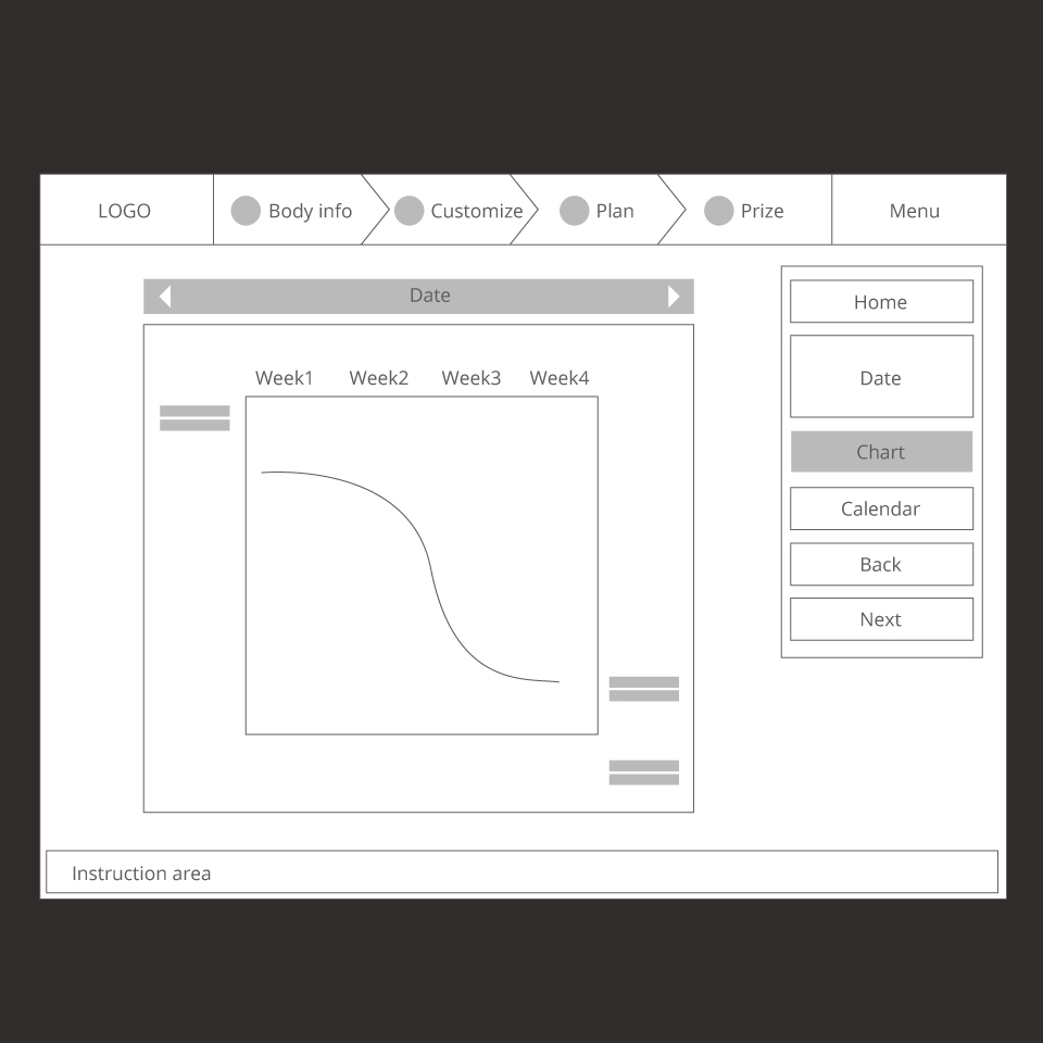
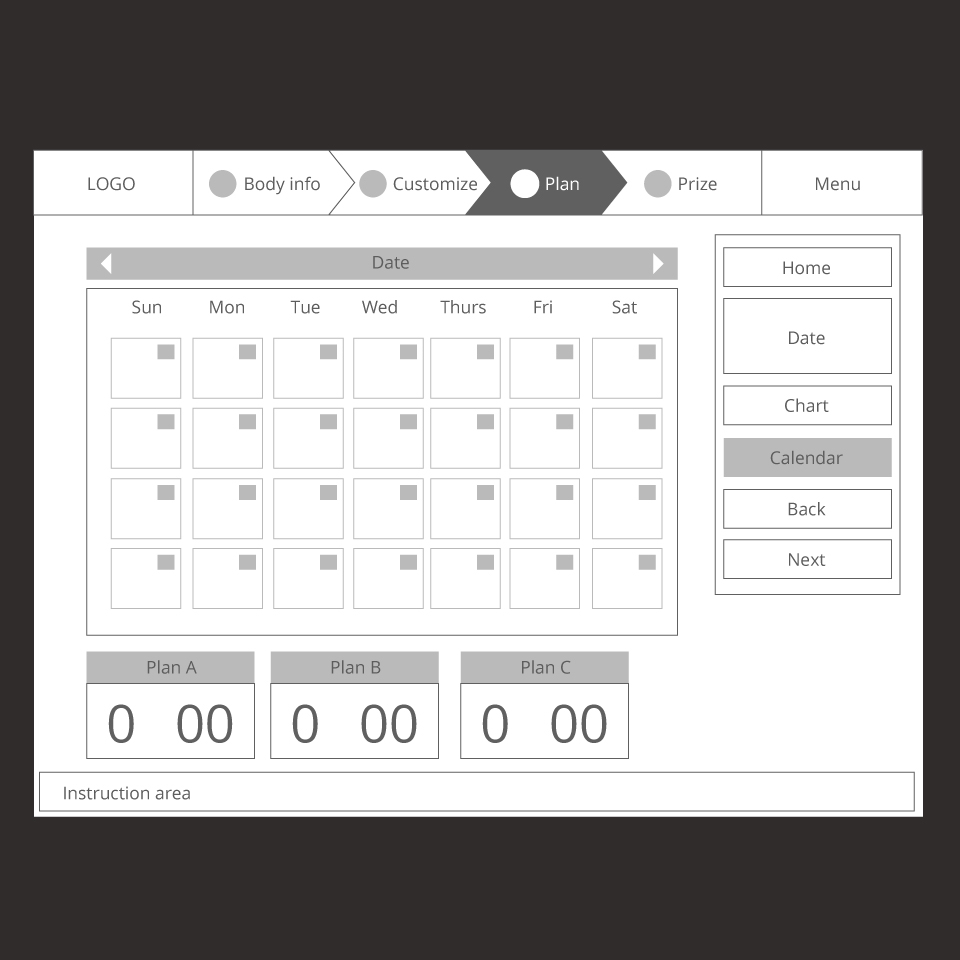
After discussion and analysis in the sketches step, we started to develop the initial and basic functions of the application. We created the low fidelity paper prototype with Illustrator. Usually, the low fidelity paper prototype is monochrome, because this project is only 10 weeks long, we pushed forward to combine the low fidelity and high fidelity prototype together to gain additional feedback from user testing.
THE PAPER PROTOTYPE & USER TESTING
More than 10 people tested this paper prototype, most of them are college students based on our targeted user group . *Obtained very helpful feedbacks from the user testing. For instance, simplify the pop-up options frames, scientific data support etc.
THE BRANCHING STORYBOARD
The branching storyboard was created after the revised paper prototype. This basic layout for first time users of this application.
*For this step, we also added the social network functions to propagate this application.
REVISED THE SITE MAP & WIREFRAMES
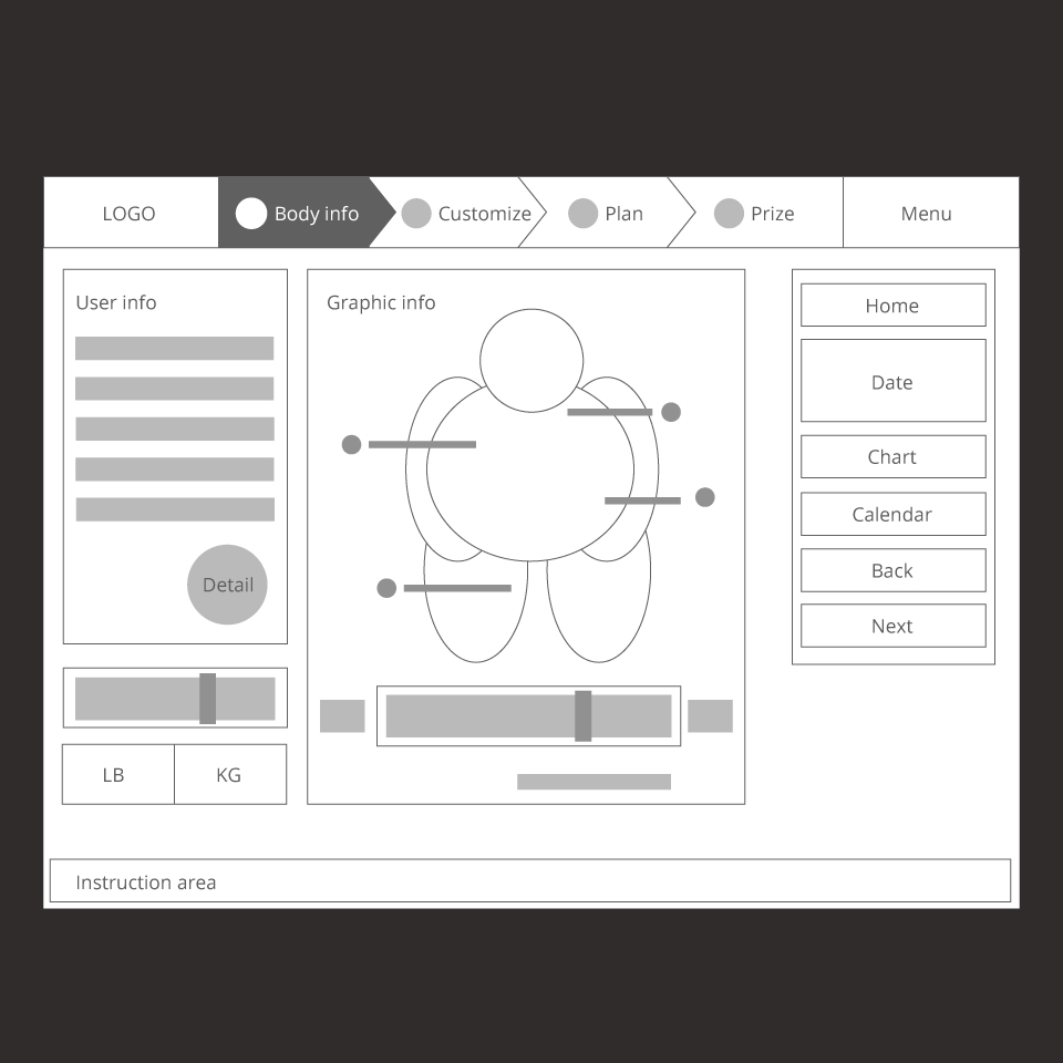
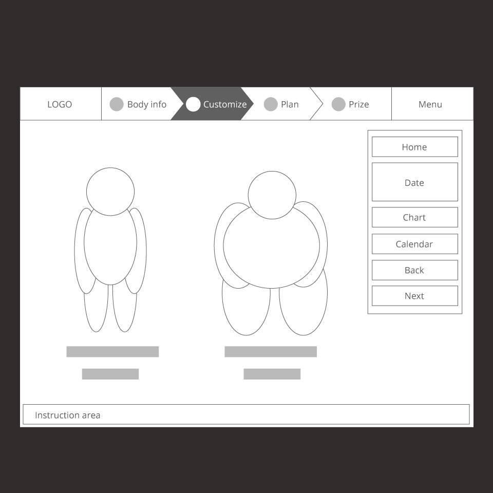
After got all the feedback from testing, we revised and created the final site map and wireframes used for final simulative prototype.
THE NARRATIVE STORYBOARD
Based on the branching storyboard to create the narrative storyboard. Because the storyboard was used for shooting the concept video instead of getting feedback from users, the storyboard created roughly.
Studio class: Visual Interface and Information Design
Project: Interactive iScale
Period:10 weeks
Award: Entelechy Awards 2014 – Faculty Nominated Video Prototyping
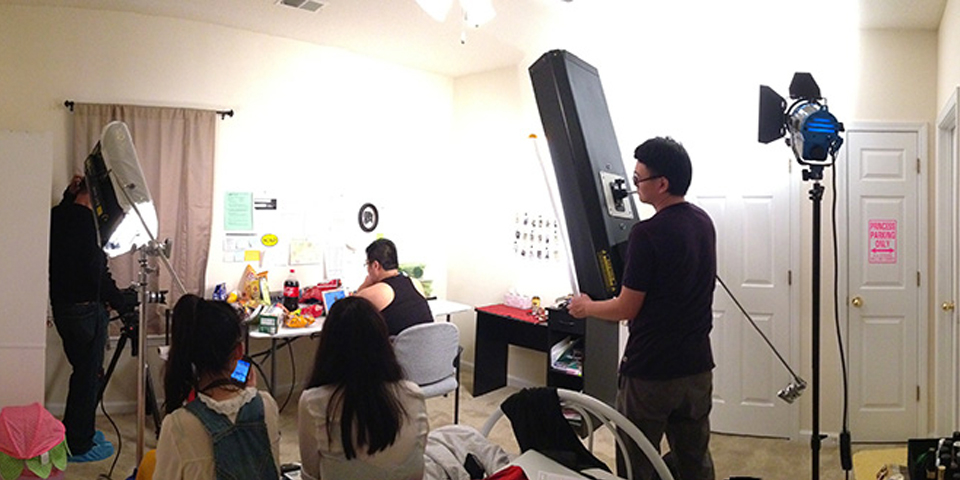
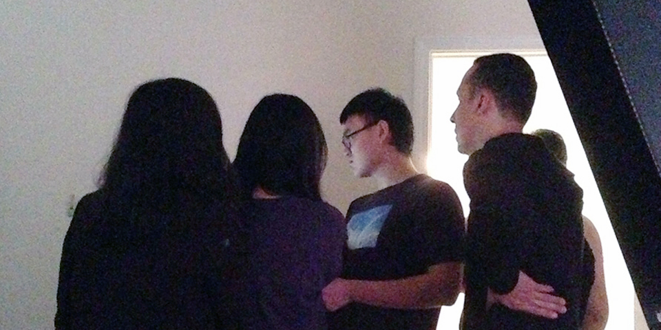
BEHIND THE SCENE
All the scenes were shot indoor. All team members and Professor Gustavo help to finish the shoot day.
Here is the final video, HD version also available on vimeo. Click here to watch.
PROTOTYPE
One version of this prototype was created for iPad users. However, it can be tested both on a laptop and iPad. Please click the image or HERE to have fun!
MY RESPONSIBILITIES IN THIS PROJECT
Generated ideas to find user problems — interactive scale
Created sketches for personal interface
Created and developed low fidelity prototype
Created the branching storyboard
Created the narrative storyboard
Participated shooting and post-synthesis concept video
Created the final iPad prototype
SOFTWARES I USED
Illustrator (Created wireframes, interface)
Photoshop (Created interface)
Motion (Made Visual effects for concept video)
Final Cut (Edited concept video)
Prototyper (Created prototype for iPad)
AWARD:
Entelechy Awards 2014
Faculty Nominated Video Prototyping


