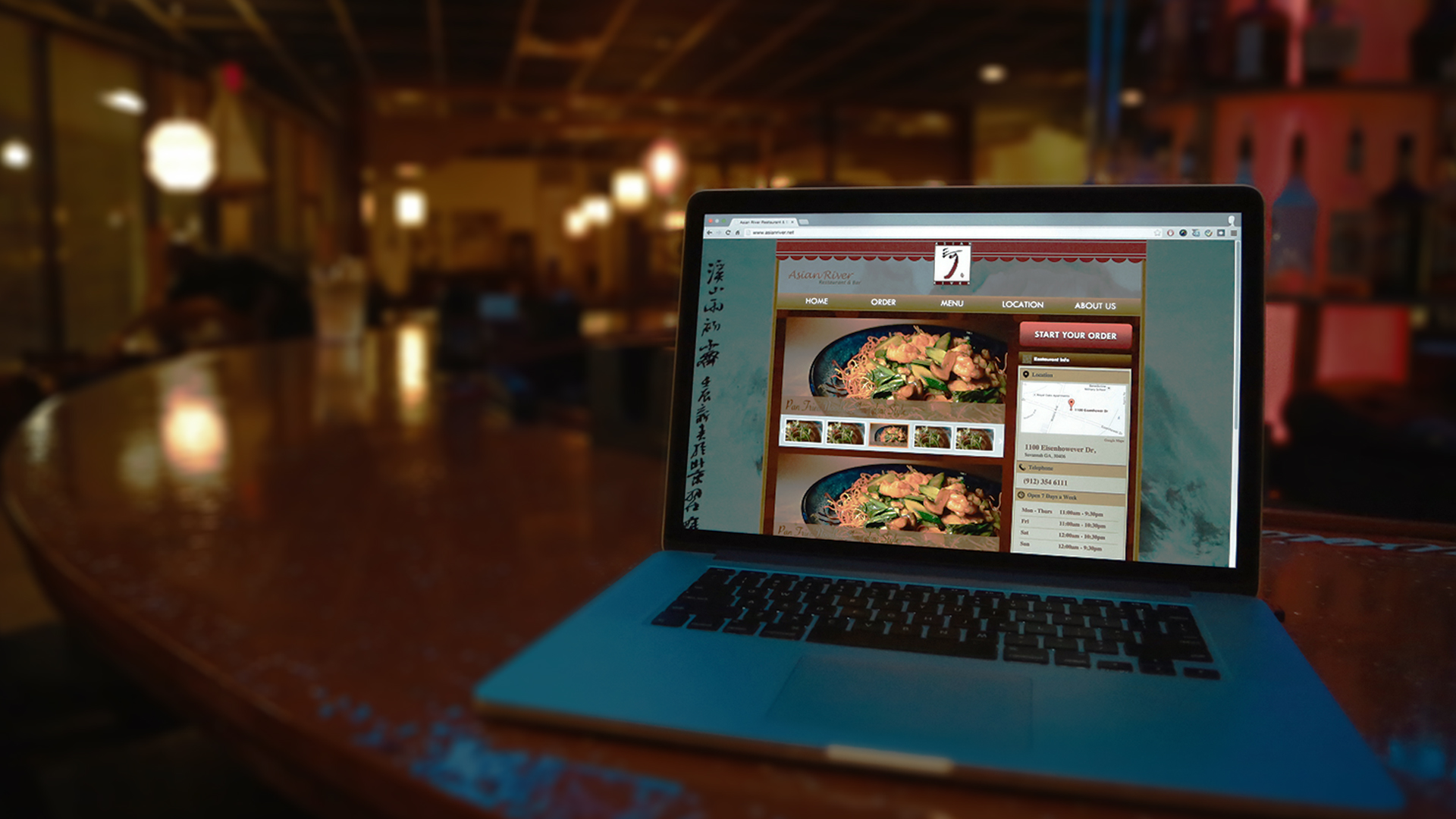
Asianriver Restaurant Website
UI & UXAsianriver Restaurant Website

About Asianriver Restaurant
Asianriver is a popular Chinese restaurant in Savannah,GA. As a full service restaurant, Asianriver doesn’t have online order function website. Customers have to make a call to place order. With the business growth, phone call spent so much time and low efficiency. For this reason, the manager of Asianriver wants to redesign Asianriver website that has the online order function to solve this problem.
Due to the specialties of Chinese dishes, there are many differences than the fast food online ordering details. But generally the ordering process is still kind of similar which I learned a lot from “Dominos” and “Pizza Hut” to this project. As online order is the most important and complicated function in this project; I had discussed with managers several times to push the project going on. After four months, the new Asianriver website finally online now. Click Here jump to the Asianriver website.
Kick Off – Rough Requirements
The manager of Asian River listed basic requirements at the beginning of this project. With the project going on, many detailed requirements were put forwarded during the design process. Thus it took a longer time to revise and edit the information. In order to have a good connection between their homepage and online ordering page, I sketched wires of these two pages at same time.
Site Map & Wires
The Asian River website has 5 main parts – Home, Order, Menu, Location, About Us. To highlight and provide ease of ordering on the restaurant’s homepage, more than one ordering link was added For instance not only can customers order from the action button on the right side of homepage, but they are also able to place orders using the dishes banner and slider icons. In addition, Asian River has over 100 dishes, these dishes not only consists of appetizers and authentic Chinese food, but also sushi and sashimi. So due to these differences, the same module cannot be used for customers to order. A greater amount of time was spent on the organization of the dishes, so that it can be viewed online with greater clarity than on a regular paper menu. In the end I created three modals for food details based on the different specialties.
Revise & Redefine
After I created the first draft sitemap and wires, I showed to the manager and waited the feedback for next step. When we were discussing these sitemap and wires the manager was more interested in what dishes I placed in the wires as an example than the wires themselves. So I started to ask her questions what I need for my next step instead of waiting their feedback. Through this process, more detailed for order has been added to online order page.
Updated Wireframes
The manager requested for the website to be put online as soon as possible, therefore, I revised the wire frames for the homepage and online ordering pages first. I used existing popular fast food online ordering sites as a reference to ensure that the Asian River’s online ordering experience will allow for customers to modify their orders at any given time.
Updated Online Order Site map
“Dominos” “Pizza Hut” “Jimmy Jones” online ordering sites offer a simple and easy online ordering experience and have a clear step by step direction. By analyzing these, I was able to create the site map for Asian River.
A Paper Pencil Sketch Before Final Design
Asian River’s main goal is to stand out as an authentic Chinese restaurant, therefore the images and colors used for the website is primarily to reflect upon Chinese culture. Chinese elements, such as Chinese columns on the top of the page, were added to the Asian River website to add a touch of Chinese detailing.For the color scheme, I chose red and yellow as these colors not only matches the interior of the restaurant but are also auspicious colors in the Chinese culture. Mountains and waters form the background image as these are often seen in traditional monochromatic Chinese brush painting.
Page Innovations & Details
Chinese Element
Chinese-inspired patterns on the top of the page show the Chinese restaurant specialty.
Action Button
An online order action button on the home page that highlight the online order function.
Never Death End Path
When customer in a ordering process, people can back to the previous step or make a change on every step.
Quick Selection
The hot deals on the right side of the order page, customer can make a quick selection without take time to find these dishes in the menu.
Final Online Version
After several time revised, here is the final Asian River website. View it here : )

