Improvement of iPhone (iOS)
Motion, UI & UXImprovement of iPhone (iOS)

OVERVIEW
This is personal project that I created during the winter break. From the initial collection of ideas to the final concept video, the project took 7 – 8 weeks. This concept video was posted on the youtube and also a Chinese video website, and it got more than 30,000 views and 300 comments in total.
This concept video was created before the introduction of iOS 7.
The core idea involved improving the iPhone usage by reducing the usage of the “home” button, which I believe will in turn provide enhanced user experience.
To allow ease of understanding for viewers, I formatted these ideas into a concept video instead of solely relying on wireframes.
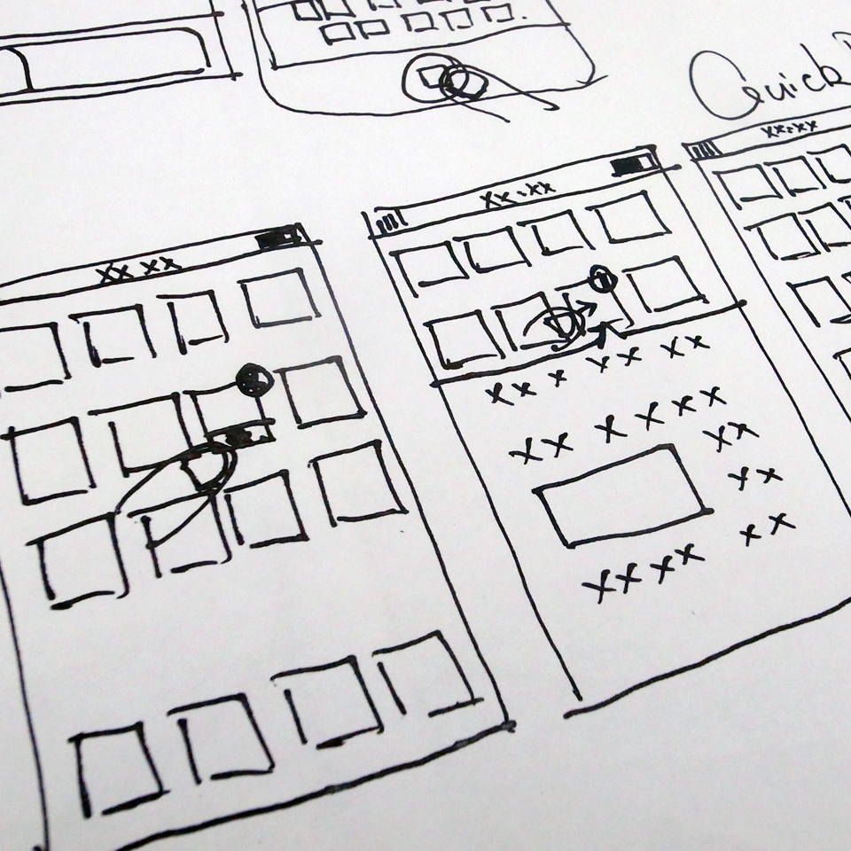
PAPER SKETCHES
As an interactive designer and iPhone user, I thought some functions of the iPhone(iOS) could be improved.
When functions are not so convenient or improvements can be made, I recorded them down.
PAPER SKETCHES
These ideas came up to my mind while using the iPhone. When I came up with a new idea, I drew on the paper with pencil, this is the way I prefer to save my ideas. Because this is the personal project, so I skip to create a wireframe and create final concept video directly after refine the ideas on paper sketches.
SOFTWARES I USED
Photoshop (Created interface based on iOS6)
Motion (Created motions and visual effects)
Final Cut (Edited concept video)
GarageBand (Sound, voice recording and editing)
KEY FINDINGS
Some of my ideas were transformed through the paper prototypes process, and other ideas were generated from this process. From the feedback from viewers, I found video prototype and simulative prototype have both advantages. To create multi functions prototypes, information architecture is very important at the beginning of the project.
Watch the final video prototype video here, or click here to watch the HD version on vimeo. : )


